Design choices I made for my personal website
December 16, 2024
I’ve been thinking about writing, or should I say, documenting the design choices I made to design this personal site of mine.
Of course, no one has persuaded me to write on such a topic. I mean, who on their sane mind would want me to blabber on this topic. Maybe somebody would. Or maybe no one does. It could well be the later, but nonetheless, let this write-up be a documentation for the future me.
Which technologies I’m using?
First of all, I’m hosting this site on GitHub Pages, as you can guess from the site domain. I also wrote a Hello World! blog post on this earlier. Besides the hosting platform, the main deciding technology was Jekyll, a static site generator which is native to GitHub Pages. I also touched on this on that post.
What else?
Well, I wanted to keep things simple. As simple as possible without hurting the user experience. I’ve used the quintessential web technologies like HTML and CSS - the basic ones. Not the offshoots. And I used almost nothing else.
Now, what do I mean by “almost”?
Well, I used just a few lines of JavaScript. And that’s for implementing the navigation menu toggle for the small screens. I wanted to avoid using JS altogether, but turned out you cannot implement the hamburger style toggle menu with using CSS only. I had to use JavaScript, just a little bit, but a little bit nonetheless.
It’s not that I hate JS. But I think if you can keep things simple, you should strive to do that irrespective of the human tendency of making things complicated. Now, adding JS might not make things complicated if you can do it properly, some would argue. But it’s my preference to not overuse it and as my design preference of keeping things simple on both front-ends and back-ends.
And I didn’t use any other web technologies. I don’t have usage of database, so I didn’t use it. As I’m using Jekyll though, and it let’s you use Markdown for your pages and posts, I am using that.
I kind of like Markdown for it is a text format. It’s human readable and a great format for keeping things simple and long-lasting.
The UI
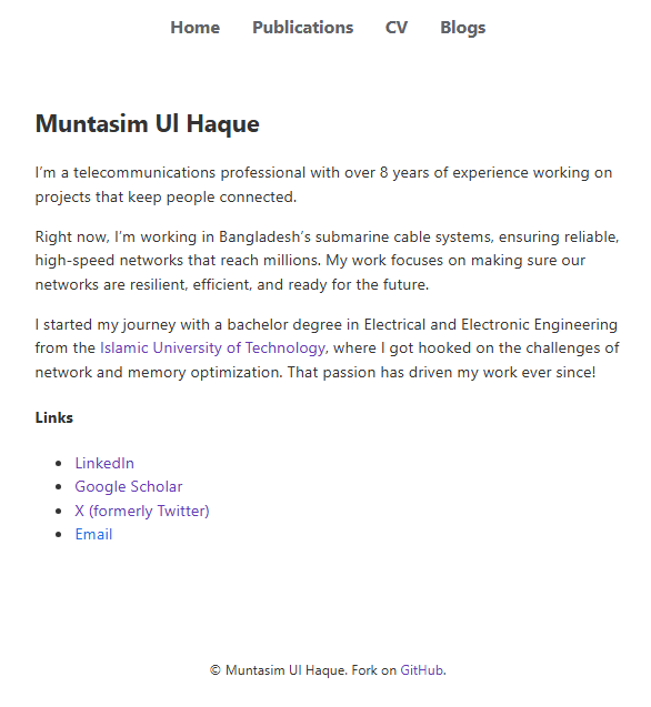
I wanted to keep the site as simple as possible. And simplicity, as they say, is the end result and not something you get at the outset. I played with lots of “looks” for the site. I tried going with profile picture, a side bar and all that. I even went with a bare minimum CSS to keep the site as minimal and as raw as possible. But neither stayed very long as they weren’t something I wanted the user to experience with.
But this one, the screenshot you’re seeing is what I stayed with. I’m referring to the screenshot as in the future, I might change things up again. But for the time being, this UI design seems perfect to me. To reach this state, I made a total of 807 commits (you’re reading it right) to the GitHub repo as of writing this post. You might think I made a commit after changing an alphabet. Otherwise, why would someone need to make so many deployments to develop such a simple-looking site? Well, you got me. Maybe I’m that noob.
The color choice
I settled with the color #333333 as the text color, as the pure black color (#111111) seemed to harsh on the eyes. The default blue color for links also seemed so bright that it seemed to literally look you in the eyes, instead of you looking into it. So instead, I used a softer blue for links, except for the navigation menu items. For navigation menu links, I used a gray-ish color to distinguish it from other links. Though for more accessible design, I could go with underlines for the links instead of relying on the colors alone. But I avoided it to keep the usability intact at the expense of accessibility.
And guess what? You’d see it being used almost everywhere, except for the accessibility related sites. Though I don’t think that justifies me going that route as everyone else does it. But I made that decision thinking of the pros and cons and as the pros weigh more in this case.
The font choice
I started with the Georgia font. Then I switched to Georgia for body texts and Verdana for headings. Then I went with Verdana for everything. And now, I’m not using any particular font, rather relying on the system default fonts. I made this choice to give the site a native look on every device it’s viewed on, though I know I lost my control on how the text would look.
The same goes for the font sizes. I toyed with different font sizes and kept some configurations for some time. But at last settled with no defined font size and giving the control to the end-user’s system. This site is currently using the system font sizes. It’s a win-win in that respect that it keeps things simple at my end and give the user control at their end.
The UX
The navigation menu, which let’s you go from page to page, changes color on hover, but the visited pages’ titles don’t change color. Because that would be weird.
The links don’t use underline by default, but on hover they do. It’s to give the reader a visual cue. I settled with it as it seemed a simple and sane default.
The visited links change color to purple as expected. I was thinking of getting rid of it to make things even simpler, but didn’t go that route either. Maybe I will later, but if I do, it would be for the blog post titles only.
Keeping things simple
I started with controlling the UI and UX aspects of the site as much as possible. That needed me to exercise that much control through code and as a result made things kinda complicated for me. Because, well, there are different screen sizes and to make the site look good at every device, you need to control every aspect of the site.
I was happy that way because I could give the user the look and feel the way I wanted them to have. But then again, modern browsers have sane defaults now and trying to control everything would just make things more complicated at my end. Simplicity was my goal from day one. And I know what I want and what I don’t.
I want to give the reader a site that is simple, minimal and make them feel welcome.
You can experience that from the color I used and the overall design choices I made. I didn’t want the site to be slow and look bad on the eye. That’s why I didn’t use any web fonts, or third party JS library, or even analytics.
So, there you have it. The post I wanted to write to document the design choices I made for this site. It’s not comprehensive, nor it is complete. I know tings will change it the future as I learn more and think better. At least, I think I could touch on the topics I wanted to cover that played important role for the site.

